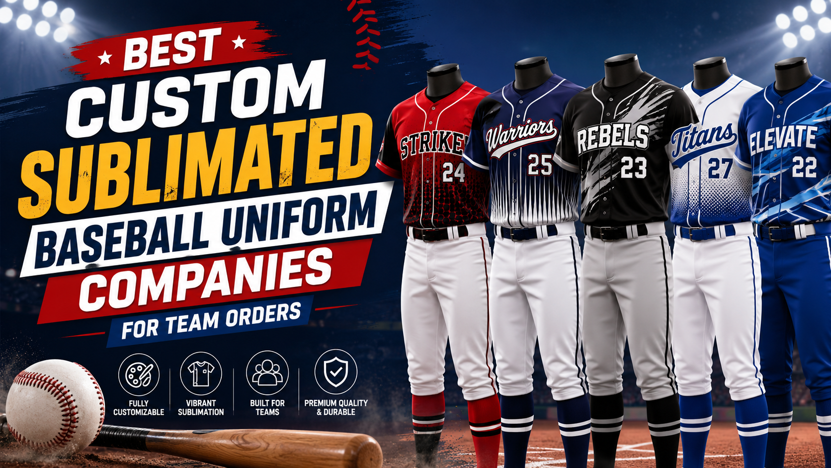
In the sports industry, from coaches to fitness experts, we all have heard somewhere in our lives, look good, and play well! Although your performance depends on practice. Still, you cannot underestimate the power of a professional-looking, cool, and crisp uniform! The color scheme, the logos matter.
But, out of all the design factors, we usually ignore sportswear typography. Choosing the right custom baseball jersey fonts is more than mere legibility. It's your team's identity! From casual school player teams to modern power-hitter baseball squads, the font tells your story even before you throw the first pitch on the ground.
In this guide, we will know everything about athletic typography. From exploring classic baseball font styles to baseball jersey number fonts and custom ideas to make your team stand out in their next league tournaments.
Source: gemini.google.com
Why Typography Matters in Baseball
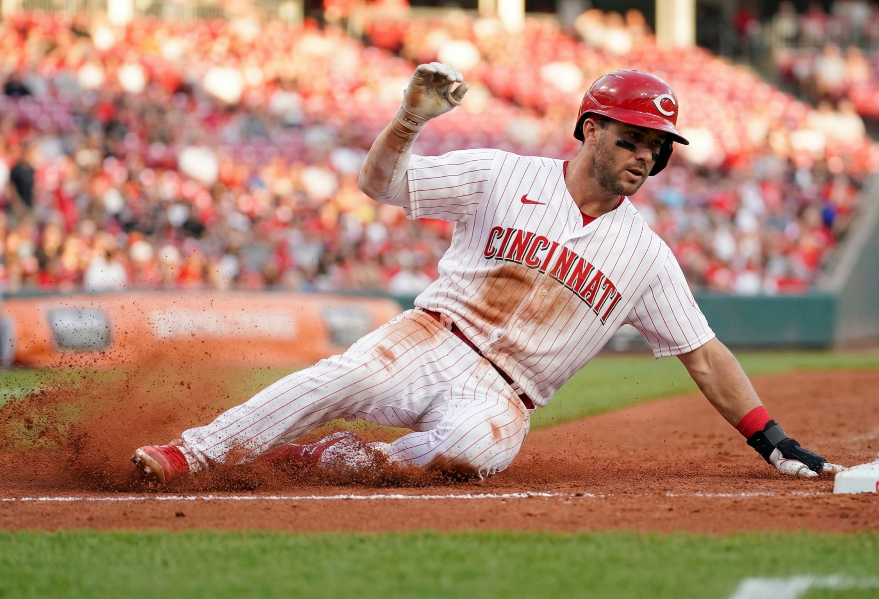
Unlike other physical sports, brands prefer logos on the chest only. In baseball, the strategy is unique and different. Sponsors prefer teams to name across the chest as it is the focal point. This tradition started back in the 19th century, and now it's a common practice to follow.
When your team's name is in the center, ultimately, the text and font you choose define your brand's power. Any irrelevant or irregular fonts could make your jersey's aesthetics cheap. Thus, you must be strategic enough to create an instant legitimacy look with a great font.
Are you looking to select the right typography style for your player outfits? Keep a perfect balance of these three elements, including:
- Legibility: Is the name clear enough for the fans and spectators to read it from the stands?
- Tradition: Is the font style great enough to complement your game's aesthetic history?
- Personality: Does it match your team's personality or not?
The "Big Three": Classic Baseball Font Styles
Generally, whenever someone browses for the best custom baseball jersey fonts, there are three most common categories. And these categories help us evaluate and choose the best uniform font ideas.
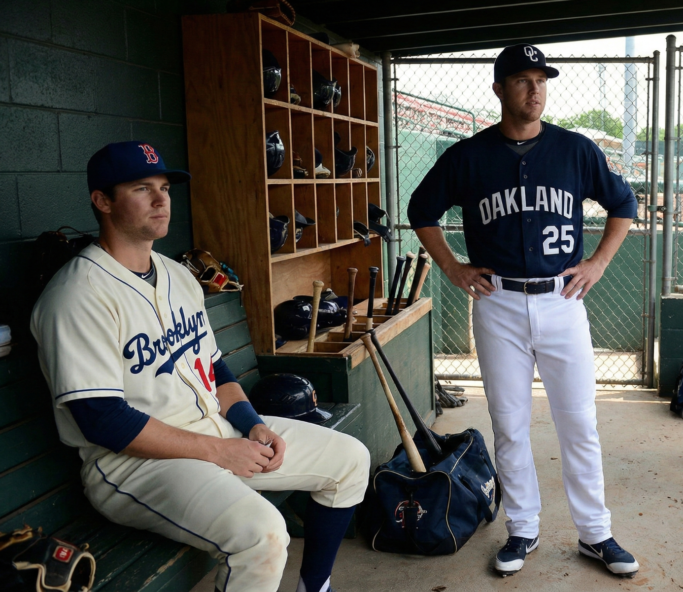
1. The Classic Script with a Tail (Swoosh)
This is one of the best, classic baseball locks! Imagine the Los Angeles Dodgers or the St. Louis Cardinals. They feature the team's name with the flowing, cursive letters of text or underline features from the last letter back to the word.
- Who is it for? Teams who love having a traditional, professional, and timeless look prefer this typographic style.
- Design Tip: The swaying design is an initial setup to highlight the secondary logo or the player's number.
- Popular Examples: Brush Script, Marcelle, Team Spirit.
2. The Standard Block
Do you know your baseball jersey standouts with an elegant script styling? The standard block fonts include bold, sans serif, and highly angular letters, like inthe New York Yankees or the San Francisco Giants. They feature strength and stability.
- Who is it for? If you want to create an overall compact, highly impressive look, it's for you.
- Design Tip: Use block fonts when designing our highly arched letter across the text.
- Popular Examples: Varsity, College, Pro Block.
3. The Tuscan / Western Style
In the baseball industry, Boston Red Sox and Vintage circus posters are known for their decorative points on the letter sides with inward curves. This is another beloved style.
- Who is it for? Create a heritage/vintage look with an old traditional aesthetic.
- Design Tip: Blend a 2-color outline with these decorative edges that pop up with this style.
- Popular Examples: Bosox, Western, Circus.
Top Picks: The Best Custom Baseball Jersey Fonts by Name
Now comes the question of how to find the leading font styles trending in the custom jersey market! No matter if you are working with a designer or using an online uniform builder, make sure to know these trendy baseball jersey fonts.
1. Varsity (The All-Rounder)
Nobody can mess with Varsity. It is one of the best, started high school collegiate bold fonts. You can use it for a compact, rigid baseball jersey number along with the team's name for font options. Create an athletic, strong, and traditional look with this font.
2. Lulo Clean (The Modernist)
For a futuristic, clean, and bold vibe, Lulo Clean is a textured 3D style. Teams prefer this modern touch on sublimated jerseys to avoid heavy embroidery.
3. Ballpark Weiner (The Nostalgic)
Ballpark Weiner is a beloved font for designers. Designers love creating a perfect 1950s painting sign look with the retro, fun style using this font.
4. MLB Block (The Pro Standard)
For official and professional teams to look at, many custom uniform fonts offer a wide variation of MLB blocks. In comparison to Varsity, it is slightly wider with squared corners. But it can be a good choice for baseball jersey number fonts.
Source: gemini.google.com
Mastering Baseball Jersey Number Fonts
Have you chosen the right font for your jersey? It's time to switch your attention to your jersey's backside as well. Apart from your players and teams' names, baseball jersey number fonts are important for referees, scorekeepers, and scouts.
The Rule of Complexity
Do not try using some complex script fonts on both the front and the jersey's back.
- Front: Script Font (e.g., "Tigers" in cursive).
- Back: Block Number.
Be very observant while deciding on any font and number contrast. Script numbers are not easily readable from a distance. So, if you have chosen your team's name in a fancy Tuscan font, make sure to complement the name with the block font for numbers.
Font Matching
Have you used block fonts for the front side? Try using the same block font for the number's jerseys back. Sometimes, consistency rewards you with a professional uniform look.
Top Number Font Styles
- Full Block: The standard square look.
- Tiffany: Try designing a block font for the sharp, classic, and elegant serif edges.
- Stencil: Create a military look for patriotic theme tournaments.
Advanced Design: Outlines, Arches, and Spacing
While designing a whole baseball sports uniform, choosing the best custom baseball jersey fonts is a simple, one-step process. But the magic lies in how efficiently you manipulate the font to make the best out of the jersey.
1. The Power of Outlines
In baseball games, single color text never creates a finesse look. To add a professional, aesthetically appealing look, you must complement it with some outlines.
- Single Outline: Use contrasting borders, like white text with navy borders, to create a single outline.
- Double Outline: Want to have thick borders with text or thicker outer borders? Use contrast like white text, a navy thick border, with a red thin border.
Pro Tip: When using script fonts, remember to use a double outline feature, as it will help you highlight the thin lettered parts on the jersey fabric.
2. Arching and Tails
Have you ever seen any baseball jersey text straight? It rarely happens! Usually, teams go for these text designs.
- Vertical Arch: Generally, the letters are straight, but the word curves. It works best with bold fonts.
- Bridge Arch: Although the word bottom is flat, the top side creates a smooth arc.
- Slanted: Keep the text straight, but rotate the word at an angle of 10 to 15° upwards. This works best with script fonts with tails to depict speed and motion.
3. Kerning (Letter Spacing)
Are you designing your team jersey on your own? No help from the designer? Beware of the kerning process! Whenever you ask for the text either on the top or the bottom, the letters always spread haphazardly. Thus, you must manually concise the space between letters to make the world readable. Classic baseball font styles must look connected with proper letter spacing.
Material Matters: Tackle Twill vs. Sublimation
Make sure to choose the font that complements the manufacturing method or vice versa.
Tackle Twill (Sewn On)
Tackle twill is the known MLB standard where manufacturers cut out the fabric layers into letter shapes and sew them on the jersey.
- Best Fonts: Bold Block, Thick Script.
- Avoid: Do not use haphazard, distressed fonts. Choose font styling with tiny details or thin lines so the fabric workers can sew them in thin lines.
Sublimation (Dyed In)
In sublimation technology, the design is directly dyed inside the fabric fibers. Create a smooth touch with access to unlimited colors.
- Best Fonts: You have the freedom to choose any gradients with different textures or complex fonts like bleeding cowboys or graffiti styles.
- Ideal For: The best choice for custom uniform font ideas that are truly impossible to sew on.
Screen Print
In the screen printing procedure, manufacturers press the ink directly onto the fabric surface.
- Best Fonts: Block and simple Script.
- Avoid: Do not use heavy gradient contrast, as screen prints usually crack over time. So, try using solid or chunky fonts in comparison to those sensitive, delicate ones.
5 Unique Uniform Font Ideas for 2026
Stuck on a design? Here are five concepts to jumpstart your creativity:
- The "Throwback" Pinstripe:
- Jersey: White with Navy pinstripes.
- Font: "Blackletter" or Old English style (think Detroit).
- Vibe: Tough, historic, gritty.
- The "Neon Lights":
- Jersey: Black base.
- Font: A thin, mono-line script in bright Neon Green or Hot Pink.
- Vibe: Travel ball, night games, energetic.
- The "Collegiate":
- Jersey: Heather Grey.
- Font: Standard Varsity Block in Maroon and Gold.
- Vibe: Clean, academic, respectable.
- The "Space City":
- Jersey: Gradient Navy to Orange.
- Font: A futuristic sci-fi font (like the NASA worm logo style).
- Vibe: Modern, fast, unique.
- The "Beer League Legend":
- Jersey: Raglan style (colored sleeves).
- Font: A bubbly, thick script with a massive tail.
- Vibe: Fun, relaxed, approachable.
Source: gemini.google.com
Conclusion: Baseball Jersey Fonts
While looking for the best custom baseball jersey fonts, keep a balance between styling and material choices. Remember, you want to go with a font that ultimately defines your player's spirit and is readable from a distance as well.
So, when evaluating classic baseball font styles, from choosing the traditional ones to the modern, minimal touch, use this smartly as your team's voice. You should always speak louder and clearer.
Are you ready to start designing? Do not choose random, generic arts? Sketch your team's name in different styles, like bold, block, or script ones at Affordable Uniforms Online, to see which perfectly aligns with your team's personality and name length. Once you finalize the font, everything rests perfectly in its place over the uniform!
Frequently Asked Questions (FAQs)
What are some popular baseball jersey fonts?
Usually, a script with a tail or the Brush Script/Marcelle font is quite popular. For block letters, teams prefer Varsity for better readability and reliability.
How can I choose a number font style for my baseball jersey?
Make the front logos decorative with readable baseball jersey number fonts. Use simple and bold fonts like pro blocks or full blocks for better visibility.
Can I use some copyrighted fonts for my custom jerseys?
If you are designing your team's jersey yourself, make sure to buy the font license! However, if you are taking help from a uniform manufacturer, they already have a range of licensed font libraries you can use legally.
Which font size is best for baseball jersey names?
For adult jerseys, the team's name font size on the front should be between 10 to 14 inches. For the jersey back side, player names must be at least 2.5 to 3 inches tall letters with numbers ranging from 8 to 10 inches tall.
What are tackle twill fonts?
Tactile twill technology works by cutting the fabric out of polyester. Then, manufacturers sew it inside the jersey. For this font, there must be thicker lines, as thin or distressed fonts will create a mess over the twill fabric.